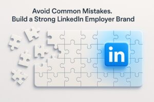

The Complete 2026 Guide to LinkedIn Design
On LinkedIn in 2026, good content alone is no longer enough.
The feed is crowded, attention spans are short, and the difference between a post that gets ignored and one that stops the scroll almost always comes down to design.
Design on LinkedIn is not just an aesthetic matter.
It is a strategic tool that translates complex ideas into clear messages, strengthens brand presence, and builds professional credibility.
At MAIA Digital, we see design as an integral part of strategic thinking.
Not something you add at the end, but something you start with.
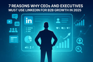
Why is design on LinkedIn more critical than ever?
On LinkedIn, unlike other platforms, design has to work especially hard.
It needs to explain an idea within seconds. Maintain a professional, non promotional tone. Serve business goals such as trust, leads, branding, and authority.
Good design does not shout. It is precise, readable, and guides both the eye and the reader’s thinking
To understand how to design in the most professional way, we spoke with Nir, the graphic designer at MAIA Digital, and asked him a series of questions covering everything you need to know about LinkedIn design.
1. Nir, how did you get into designing for LinkedIn, and how is it different from designing for other platforms?
I came to LinkedIn design through working with large companies, where I realized that this is a platform where design must serve a business goal, not just look good. Unlike platforms like Instagram and Facebook, LinkedIn design needs to be precise, readable, and authority building. Less noise and more clear messaging that works together with the content and leads to action.

2. What is the most common mistake you see in LinkedIn designs?
The most common mistake is treating LinkedIn like Instagram or Facebook. Too much visual clutter, loud colors, and effects, instead of clean design that delivers one clear message.
3. What is more critical on LinkedIn: strong creative or clear information hierarchy?
On LinkedIn, people scan content rather than consume it deeply.
Strong creative without hierarchy fails. Good hierarchy, even without standout creative, still works.
4. If we dive into the technical side, what are the optimal sizes for LinkedIn designs today?
- Regular post, single image:
1200×1200 ratio 1:1 works best
1200×628 horizontal, less powerful in the feed - Carousel or document PDF:
1080×1080 per slide
Or 1080×1350 for a taller, clearer look - Link preview or featured:
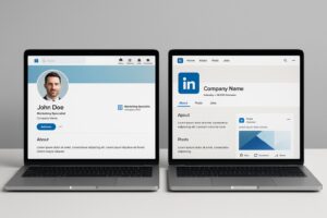
1200×628 ratio 1.91:1 critical for links - Personal profile banner:
1584×396 - Company page cover:
1128×191
Save this.
5. Why does 1:1 still work, and when would you recommend switching to 4:5 or 16:9?
1:1 almost always works because it looks good on both mobile and desktop.
I mainly move to 16:9 for articles or content that requires a wider context.

6. What does a safe design that does not get cropped in the feed look like?
I make sure that text and headlines are centered, with generous margins on all sides.
No critical elements on the edges, and the main message needs to be readable within one second, even when the image is small.
Do you work with fixed safe zones?
After five years of designing for LinkedIn, I know the safe areas by heart and can visualize them without marking them.
7. What makes a carousel successful on LinkedIn from a design perspective?
A first slide with one sharp, clear message that stops the scroll.
Consistent hierarchy across all slides so the eye does not need to relearn the layout each time.
Minimal text, a clear reading rhythm, and a unified design that serves a thought sequence rather than a collection of pretty designs.
How much text is too much on a single slide?
There are no strict rules.
In the end, the eye is the best measure.
8. What are the main differences between organic and paid post design?
An organic post delivers value or information.
A paid post comes with a clear intention.
Its design needs to lead to action, whether that is a purchase, learning more, or directing the user to a destination such as a landing page.
9. What is one winning tip for capturing the reader’s attention?
GIFs or motion can work when used subtly.
Slow animation, short loops, one moving element and not the entire screen.
The goal is to break the static nature of the feed.
10. Which fonts work best on LinkedIn and why?
I work with simple fonts because they maintain a clean look in a crowded feed and on small screens.
They convey seriousness and professionalism without pulling unnecessary attention away from the message.
In practice, the most effective fonts are Inter, Helvetica or Helvetica Now, and Roboto.

11.Which colors tend to disappear on LinkedIn and which stand out?
Colors that are too subtle tend to disappear in the feed, such as light gray, light blue, beige, and pastels. Black and dark blue stand out much more.
12. How do you balance colorfulness with a professional look?
I always keep one leading color, with all other colors supporting it.
13. How can design make a brand feel more human on LinkedIn?
By not trying to look too branded. Less perfect symmetry, less rigid grids, more natural spacing. Real images and elements that feel useful rather than promotional.
14. What makes a design feel cold or overly corporate?
When it feels like it is trying to sell instead of explain.
A few final questions:
15. What do you enjoy designing most on LinkedIn?
I enjoy it most when design helps people understand something, not just be impressed by it.
16. How do you know a design worked?
Results, engagement, and responses.
One sentence a brand should remember before uploading a design to LinkedIn:
Strong LinkedIn design does not feel like an ad.
In the end, LinkedIn design is not about trends or about what looks good right now.
It comes down to one simple question:
Does the design help the person on the other side of the screen understand, trust, and remember the brand better?
When design works well, it does not steal the spotlight.
It allows the content to shine.