Cracking the visual storytelling code of the Israeli tech ecosystem
72,007 organic impressions in 1 month
Context
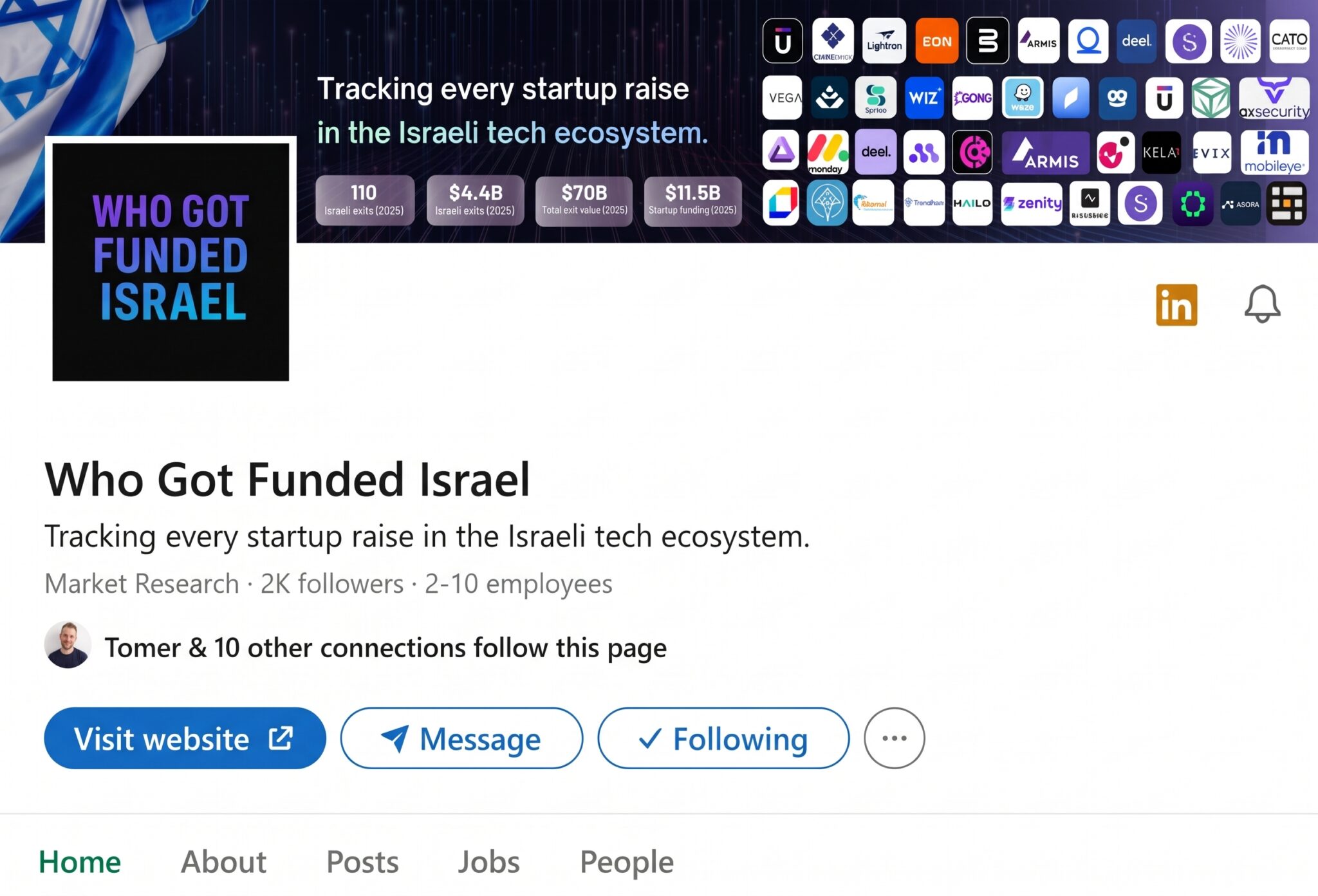
The Israeli tech industry moves at breakneck speed. Who Got Funded was created to be the community’s compass: a LinkedIn page that reports who raised money, who exited, and which VCs are investing.
The goal was to become the central meeting point for entrepreneurs, investors, and job seekers by making funding and exit data as easy as possible to consume.
Challenge
The average LinkedIn user is drowning in content. Funding news usually gets lost in long articles on financial sites or in generic text-only posts.
The challenge was twofold:
The scroll stopper: getting a busy professional to stop scrolling on our report, specifically
Memorability: making sure people remember Who Got Funded as thesource of the information
The goal was to beat feed blindness and information overload, and get people to stop scrolling
Approach
A visual strategy built on the psychology of how people consume content in the feed.
01
Color-coded visual language
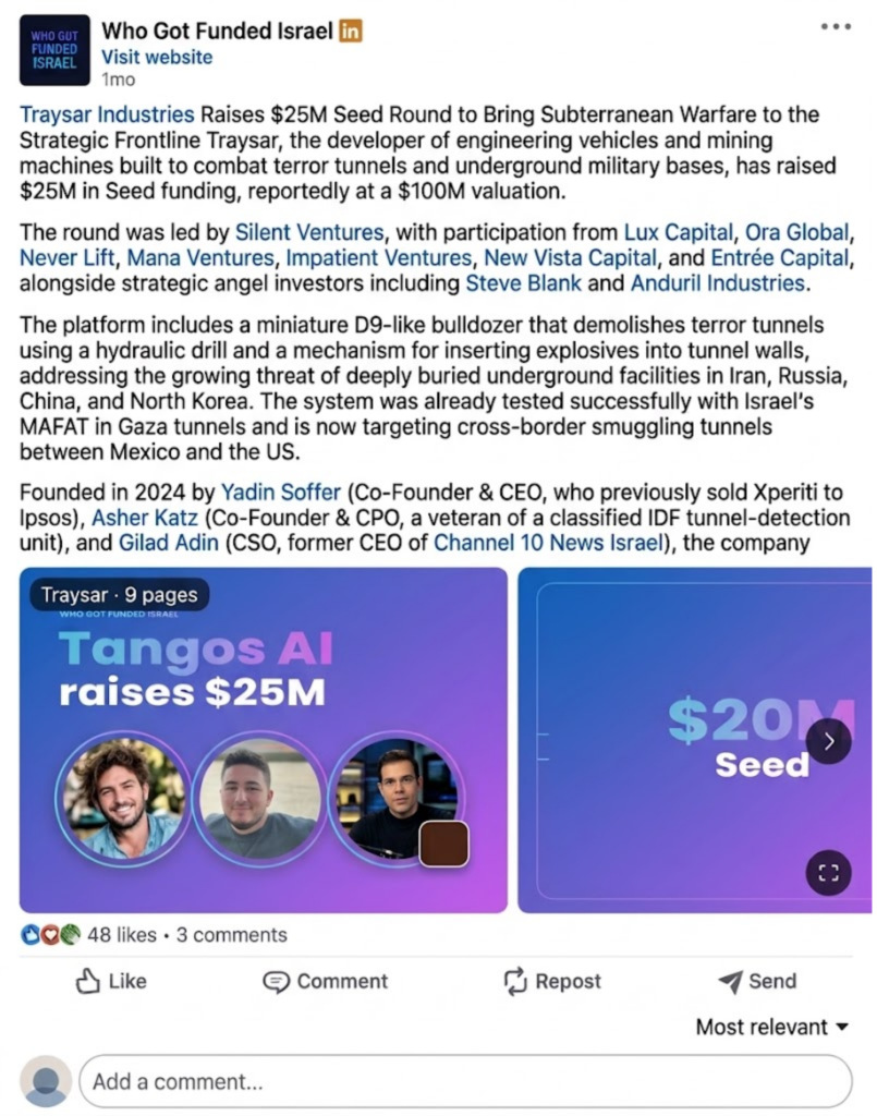
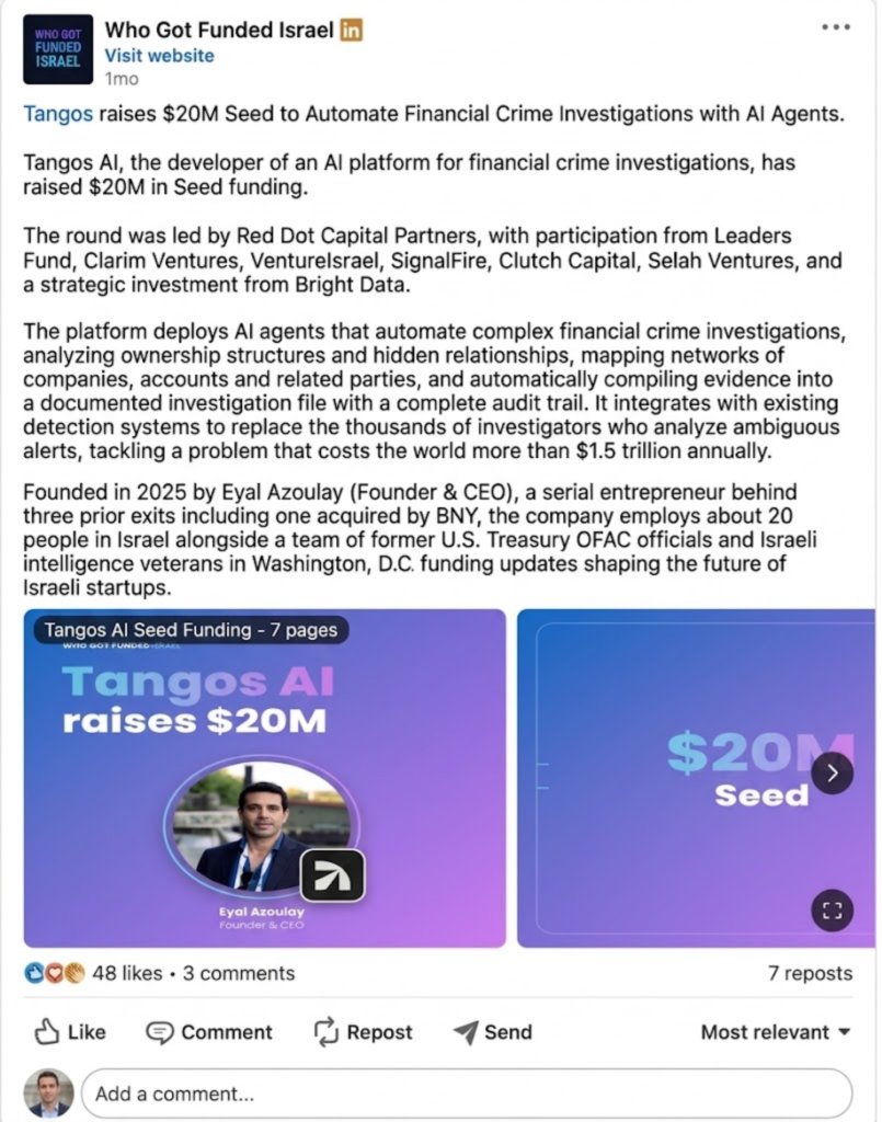
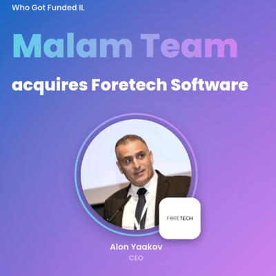
Fixed cover styles tell followers what kind of news they’re seeing before they read a single word, reducing cognitive load.
Funding round
Exit / M&A
New fund
02
Humanizing the data
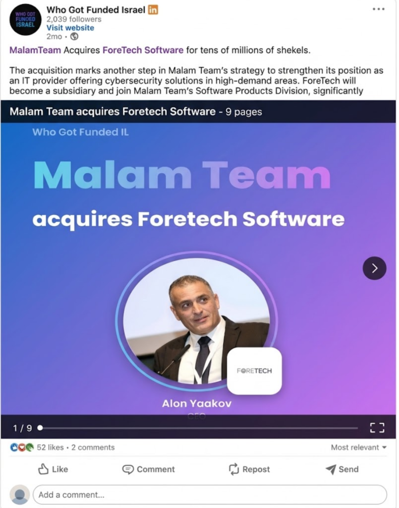
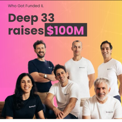
Financial data is cold, so every report becomes a human success story. Each carousel opens with a group photo of the team, followed by a slide for each founder with a short, concise professional description of them.
Fun fact: photos with human faces are 38% more likely to get likes.
Georgia Tech & Yahoo Labs study of 1.1M Instagram photos, 2014
03
Active tagging
Instead of waiting for the algorithm, we tagged the founders, the companies and the VC firms in every post. Each tag notifies an influential person in the ecosystem, who often reacts and shares, putting the page in front of a highly relevant audience.
Results
LinkedIn page analytics from the first month, December 2025 to January 2026.
Organic reach
With zero media budget, the page reached 72,007 organic impressions in its first month, proving the market was hungry for this format.
The audience didn’t just consume the information. They engaged with it, and the community grew at a pace usually reserved for pages with large ad budgets.
0K+
organic impressions, $0 media budget
new followers the 1st month
0
total followers
0
reactions
0
comments
0
clicks to open jobs
0
The shift in approach
What changed when funding data stopped being a report and became a story.
Long financial articles
→
Visual carousels built for the feed
Logos and numbers
→
Founders’ faces and their stories
Waiting for the algorithm
→
Tagging founders, companies and VCs
News only
→
News plus open positions
Data → Story
Why it worked
In 2026, beating the algorithm isn’t about more content. It’s smarter content.
Turning dry funding data into a human, visual story helped Who Got Funded win attention in the Israeli feed and build a loyal community of founders, investors, and decision-makers within its first month.
01 Friendly faces: the people behind the money, not just logos
02 A fixed visual language that builds a memorable brand
03 Actionable content: news plus a career opportunity
04 Tagging that reaches the ecosystem’s key players